


Overview
Jamtech Technologies delivers Responsive Web Design services that create seamless, mobile-friendly experiences across desktops, tablets, and smartphones. Our team combines UX and SEO integration, HTML Responsive Web Design, and data-driven UX design to build layouts that adapt beautifully to every screen size. Each website is crafted to improve usability, strengthen UX and Web Design Service, and support better engagement, rankings, and conversions. Whether you need a new build or want to improve how to create a responsive website experience, we design fast, scalable solutions that help your business perform better on every device.

Plan your build
Share your goals for Responsive Web Design and we will map scope, timeline, and team fit.
- Free consultation
- Clear milestones
- Dedicated project team
What we deliver
In today's day and age, having a responsive website is no longer a luxury but a necessity. With the proliferation of Smartphones, tablets, and other mobile devi
-

User-Centric Approach
Our responsive web designing process begins with a deep understanding of your target audience and their browsing behaviors. We craft user-centric designs that prioritize usability, accessibility, and engagement across all devices, ensuring a seamless and intuitive experience for your visitors. -
Customized Solutions
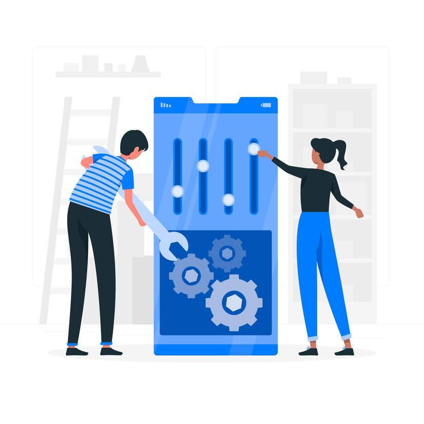
We understand that every business is unique, and cookie-cutter solutions won't cut it. Our team of skilled designers and developers works closely with you to understand your brand identity, goals, and requirements, crafting bespoke responsive websites that reflect your vision and resonate with your audience. -

Technical Expertise
With years of experience in the industry, our team possesses the technical expertise and proficiency in the latest web technologies and frameworks essential for responsive web design. Whether it's HTML5, CSS3, JavaScript, or responsive frameworks like Bootstrap or Foundation, we leverage the right tools and techniques to build fluid and flexible websites that perform seamlessly across devices. -

Optimized Performance
In today's fast-paced digital world, speed matters. Our responsive websites are optimized for performance, ensuring fast load times, smooth navigation, and an overall snappy user experience. We implement best practices for code optimization, image compression, and server-side performance to deliver lightning-fast websites that keep users engaged and satisfied. -

Scalability and Future-Proofing
Our responsive web designs are built with scalability in mind, allowing for easy expansion and adaptation as your business grows and evolves. Whether you need to add new features, integrate third-party services, or optimize for emerging devices, our solutions are flexible and future-proof, ensuring longevity and investment protection. -

Comprehensive Support
Your journey with us doesn't end with the launch of your responsive website. We offer ongoing support and maintenance services to keep your website running smoothly and securely. From regular updates and security patches to performance optimization and troubleshooting, we're here to ensure your website remains a reliable asset for your business. -
SEO-Friendly Designs
Our responsive web designs are optimized for search engines, ensuring maximum visibility and discoverability for your website. We follow SEO best practices, including mobile-friendliness, fast loading times, and structured markup, to improve your website's ranking and drive organic traffic. -

Enhanced User Engagement
Responsive web design fosters better user engagement by providing a consistent and intuitive browsing experience across devices. With features like touch-friendly navigation, interactive elements, and seamless transitions, we ensure that users stay engaged and immersed in your content, leading to higher conversion rates and lower bounce rates. -
Cross-Browser Compatibility
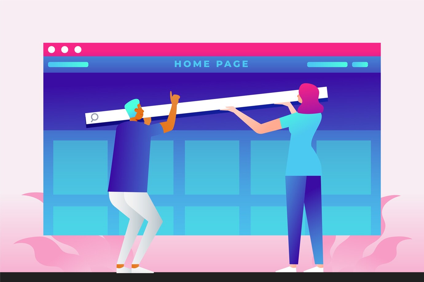
Our responsive websites are tested rigorously across various web browsers and platforms to ensure consistent performance and functionality. Whether users are accessing your website on Chrome, Firefox, Safari, or Edge, they can expect a seamless and optimized experience, regardless of their browser preferences.
Why Jamtech for Responsive Web Design
We have been managing to create such adaptable layouts, graphics, and content that fiercely change depending on the user's device—a Desktop, Tablet, or Smartphone—this strategy prioritizes the best possible user experiences as well.
How we stand out
-

Proven Expertise
With a team of seasoned designers and developers, we have a proven track record of delivering exceptional responsive web design solutions. Our expertise spans a wide range of industries and project complexities, ensuring that we can meet your unique needs and exceed your expectations. -
User-Centric Approach
We prioritize the user experience in every aspect of our responsive web design process. By understanding your target audience and their browsing behaviors, we craft intuitive and engaging designs that resonate with users and keep them coming back for more. From seamless navigation to visually appealing layouts, we ensure that every interaction is a delight for your visitors. -

Customization and Flexibility
We believe that one size does not fit all when it comes to responsive web design. That's why we offer fully customized solutions tailored to your specific requirements and brand identity. Whether you need a sleek corporate website, a dynamic e-commerce platform, or a captivating portfolio, we have the expertise to bring your vision to life with precision and flair. -
Progressive Technologies
Our team stays at the forefront of technology trends and innovations to deliver progressive responsive web design solutions. We use the latest tools, frameworks, and techniques to ensure that your website is not only visually stunning but also fast, secure, and future-proof. From HTML5 and CSS3 to responsive frameworks like Bootstrap and Foundation, we harness the power of technology to deliver results that exceed your expectations. -

Uninterrupted Integration
Your responsive website is not just a standalone entity but an integral part of your broader digital ecosystem. We ensure uninterrupted integration with your existing systems, platforms, and third-party services to create a cohesive and interconnected online experience for your users. Whether it's integrating with your CRM, e-commerce platform, or social media accounts, we make sure that your website works flawlessly with your other digital assets. -
Continuous Support and Optimization
Our commitment to your success doesn't end with the launch of your responsive website. We offer continuous support and optimization services to ensure that your website remains performant, secure, and up-to-date. From regular updates and security patches to performance optimization and analytics insights, we're here to help you maximize the ROI of your responsive web design investment.
Frequently asked questions


Talk to the Engineers Who'll Actually Build Your Product
Get a free 30-minute consultation with our senior team, no sales reps, no scripts. Walk away with a clear scope, realistic timeline, and fixed-price estimate for your project.